A NEW DASHBOARD FOR QUICKBOOKS
The challenge: Redesign the QuickBooks dashboard. Deliver a mobile-responsive, customizable layout on a new grid, plus several new data visualizations, a new look and a beautiful loading experience.
The timeline: Ten weeks. This work was completed in parallel with the new setup guide for QuickBooks.
My role: Lead interaction designer, with support from a visual design partner, and seven contributing designers.
CUSTOMER PROBLEM
The QuickBooks homepage provides small businesses with an overview of their business and is home to several crucial communication channels like alerts, tasks, and other guidance. In addition to being an information hub, it's the first page users see, so it's important that it makes a great first impression. In terms of content, the dashboard was a one-size-fits-all page that also couldn't accommodate a wide range of device sizes. Moving the dashboard into a personalized, mobile-ready future was going to require two efforts:
figuring out a grid that would work across device sizes, and
redesigning everything on the dashboard, with help from designers and developers who hadn't worked on the homepage before.
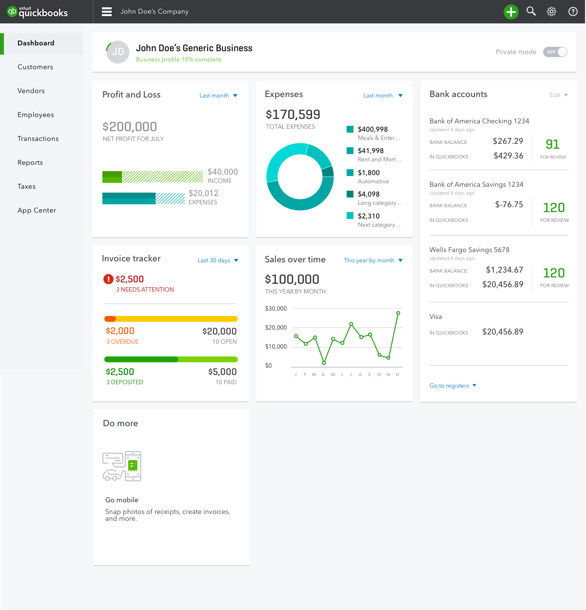
The old QuickBooks Online dashboard
The dashboard's rectangular widgets would stretch to fit large screens, which made the charts awkward at large sizes, and did not translate to mobile screens. We also wanted the new dashboard to support configuration, even if we weren't going to deliver it in this release. The old dashboard had five widgets, and we wanted to enable other teams contribute new ones. Whatever we designed had to be able to accommodate much more content.
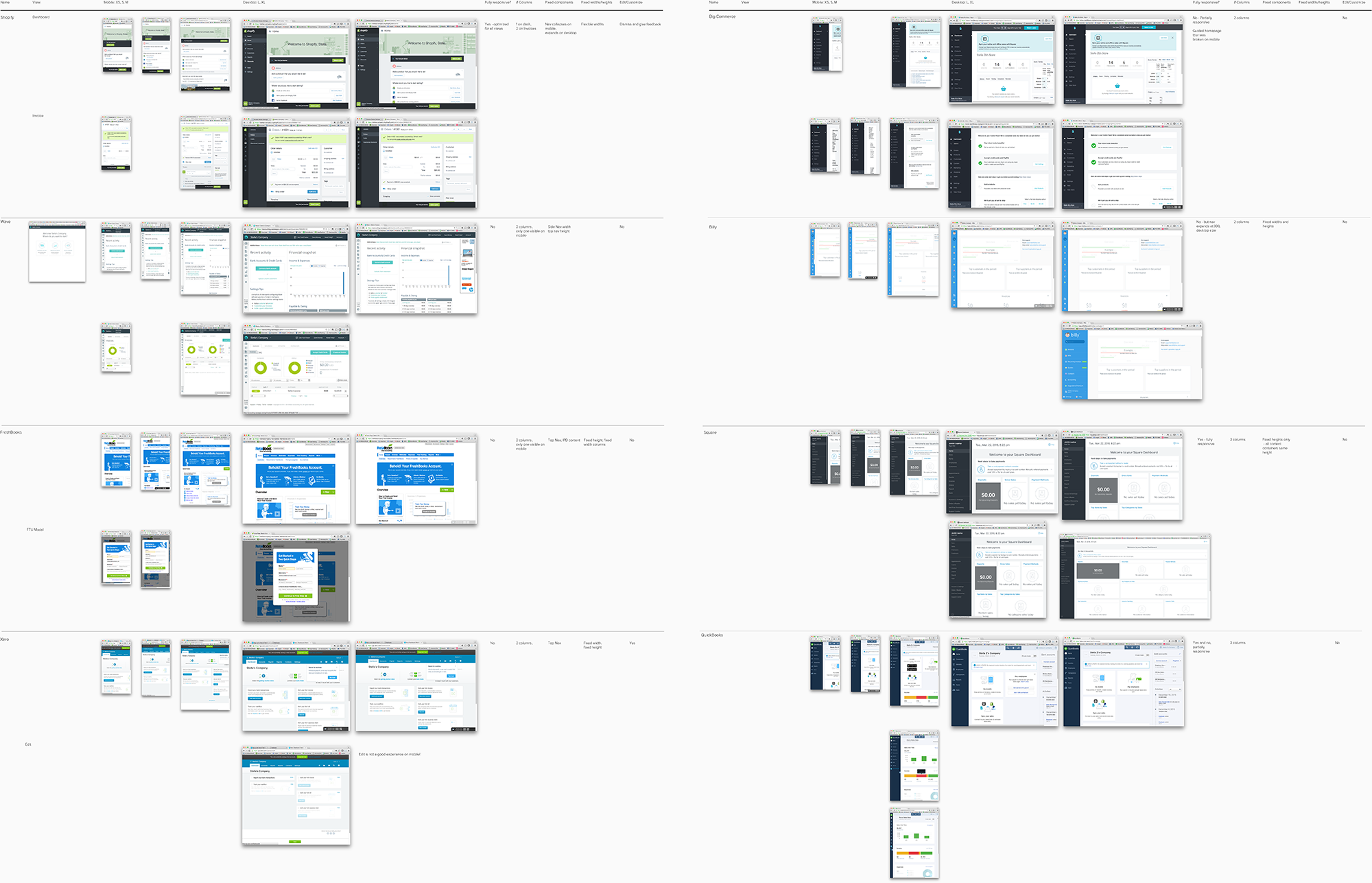
EARLY THINKING & COMPETITIVE REVIEW
To figure what the new underlying grid structure would be for the quickbooks homepage, I conducted a quick review of other dashboards and small business SaaS software. Few companies had made their products or homepages mobile responsive.
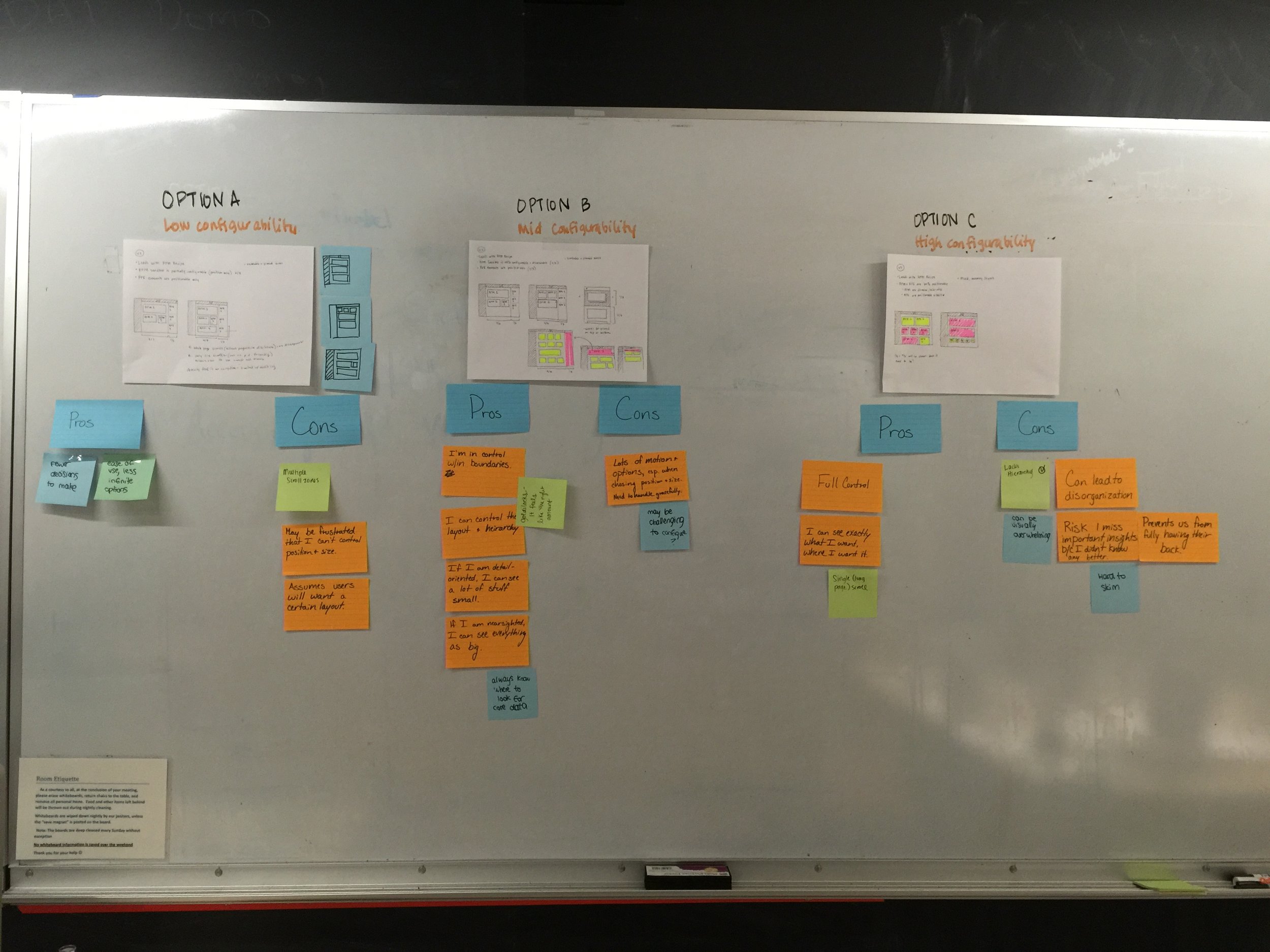
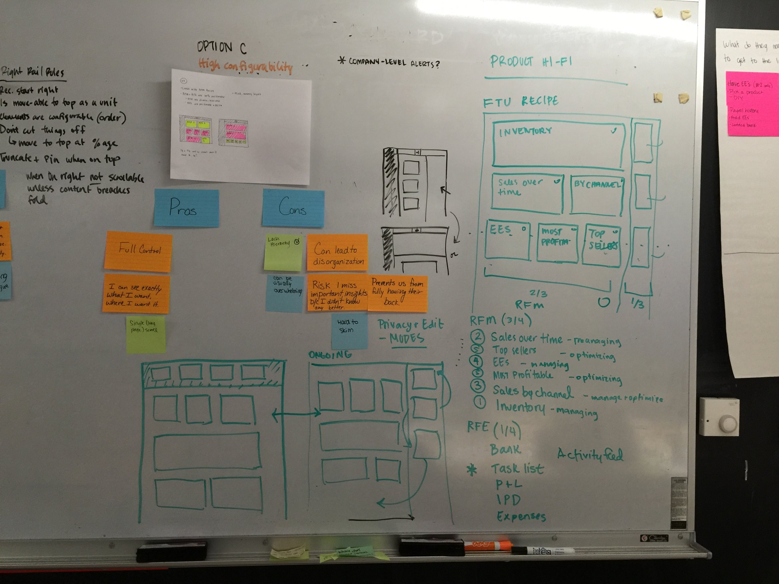
I spent some time sketching out and exploring different grid structures (two, three and four columns, mosaics, and more) and evaluating the pros and cons of each. I also did some brainstorming and evaluating different frameworks with my team on how we might approach customization –including to what degree our users might be allowed to customize and control the content on their homepage.
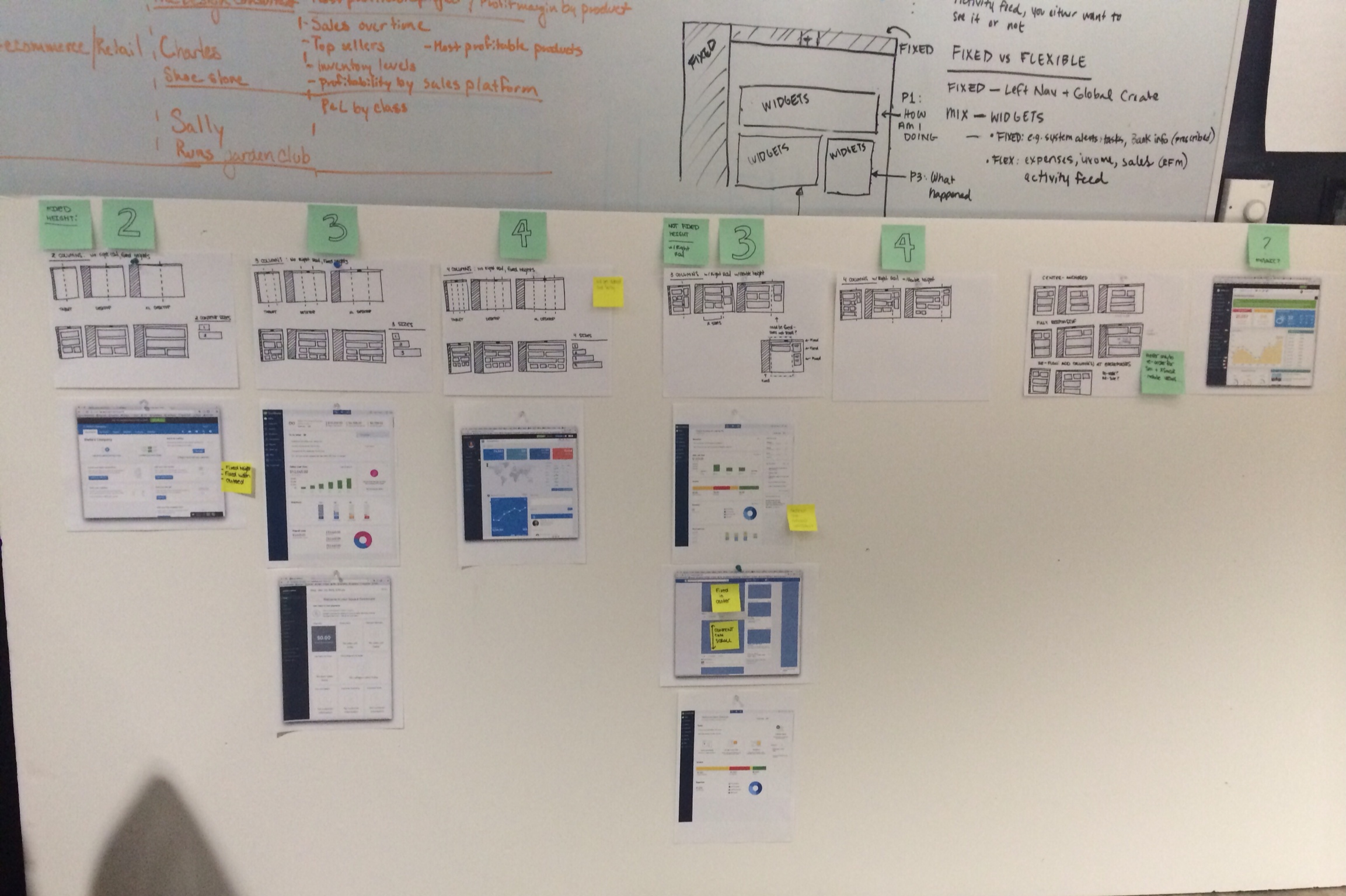
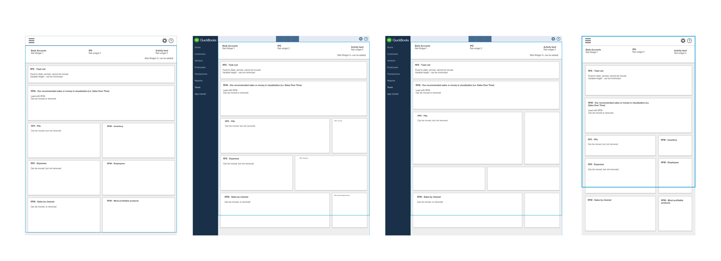
GRID EXPLORATION
To figure out how the new dashboard could be structured on small mobile devices (320px wide to 1600px) and wider desktop monitors, my visual design partner and I explored different constraints on dashboard widgets: fixed heights, fixed widths, or both fixed heights and widths.
We were looking for a structure that looked elegant and modern, would be flexible across a wide range of device sizes, and would be easy for users to read and customize.
We also needed a structure that minimized complexity for designers and developers. More sizes meant more work – more designs for designers to deliver, and more versions of widgets to build, test and maintain.
We did several rounds of exploration on widget sizing and design, and evaluated the pros and cons of each idea from the point of view of all our stakeholders for the dashboard: first – and most importantly – our customers, then our designers and our developers. These explorations also, crucially, revealed some structures that would never work.
After evaluating the pros and cons, we aligned on a structure that allowed widgets to have two fixed heights and two widths. We knew the real test of our model would be to populate the widgets in the new structure with actual charts and content. The wireframes below allowed us to iterate quickly and share our thinking as it evolved.
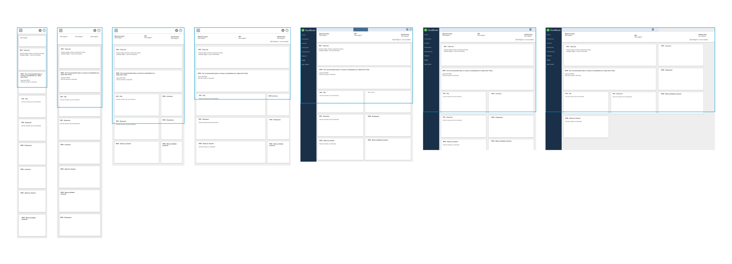
TESTING THE NEW GRID
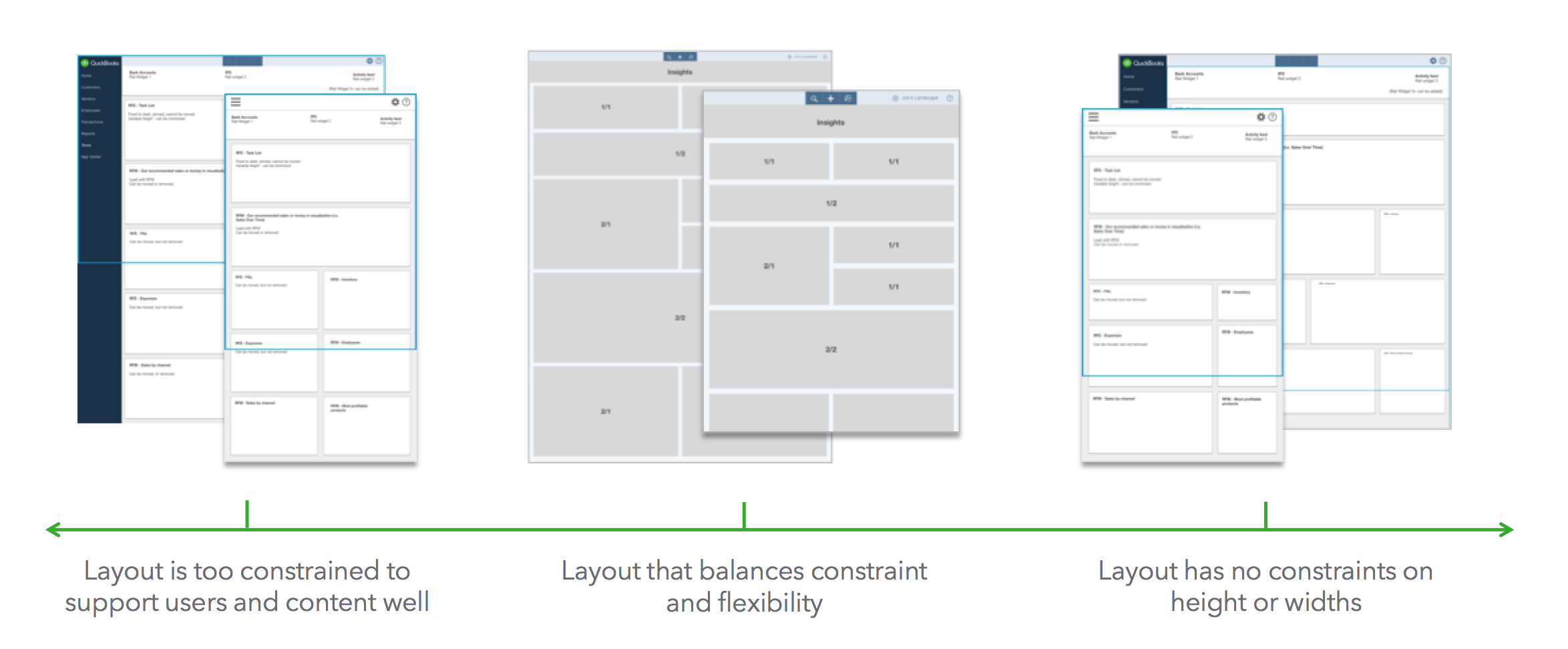
After deciding on a grid, we explored how the data visualizations from the old dashboard might look in the new framework. How would data move around in these new widgets? How would it flex?
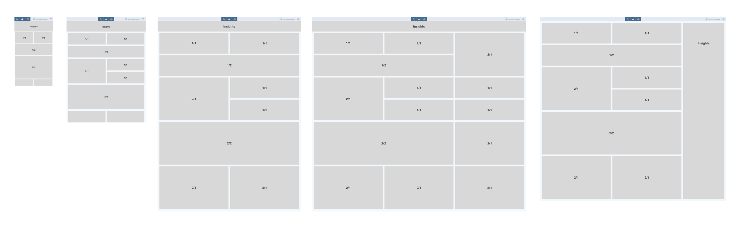
After several iterations, my visual design partner and I realized what best served the content and all our stakeholders: make all the widgets squares. As he put it, to our delight in a meeting one day: 'squares are just, like, a universal shape'. I was not expecting to like the square grid, but it quickly grew on me. It was flexible across device sizes and layouts, felt modern and elegant, and it reduced the complexity of laying out information across containers that varied in shape.


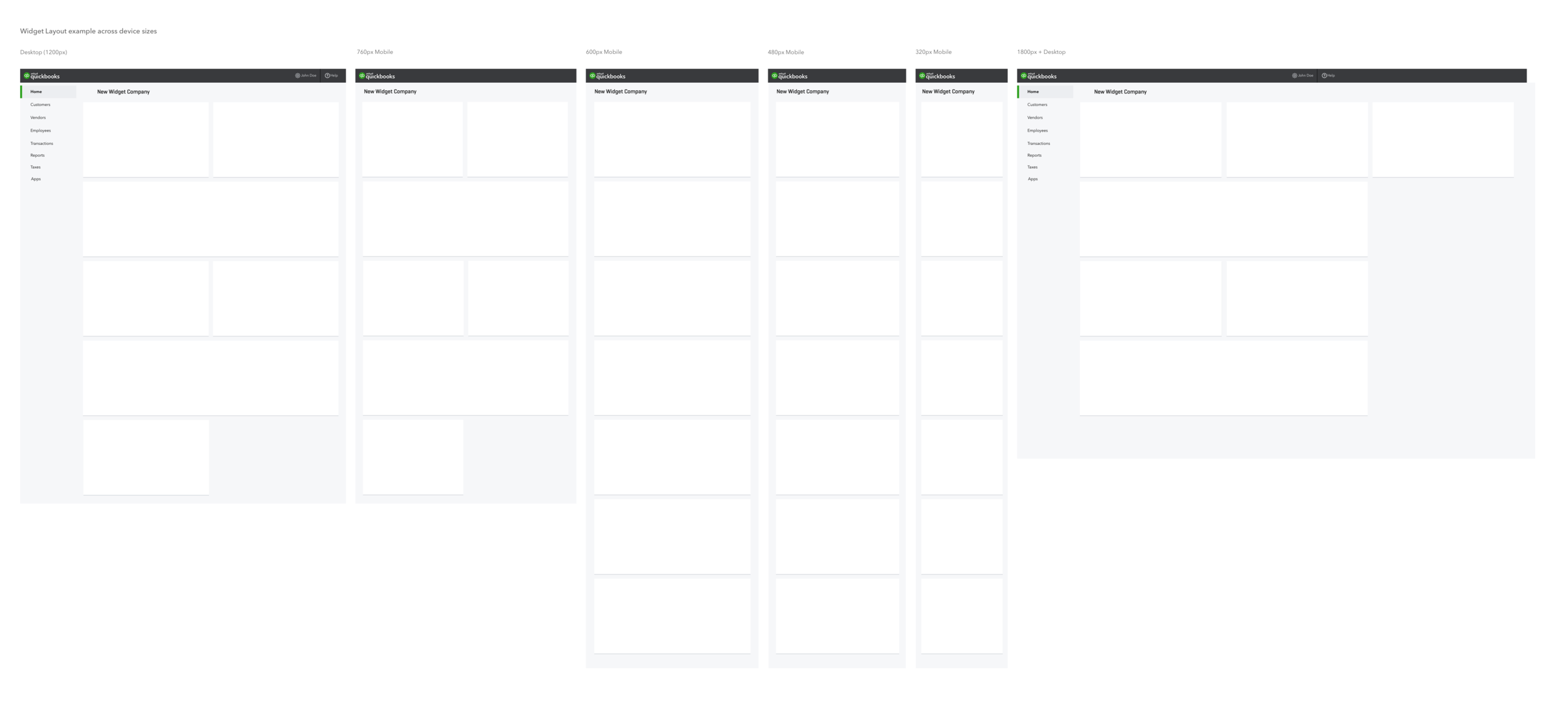
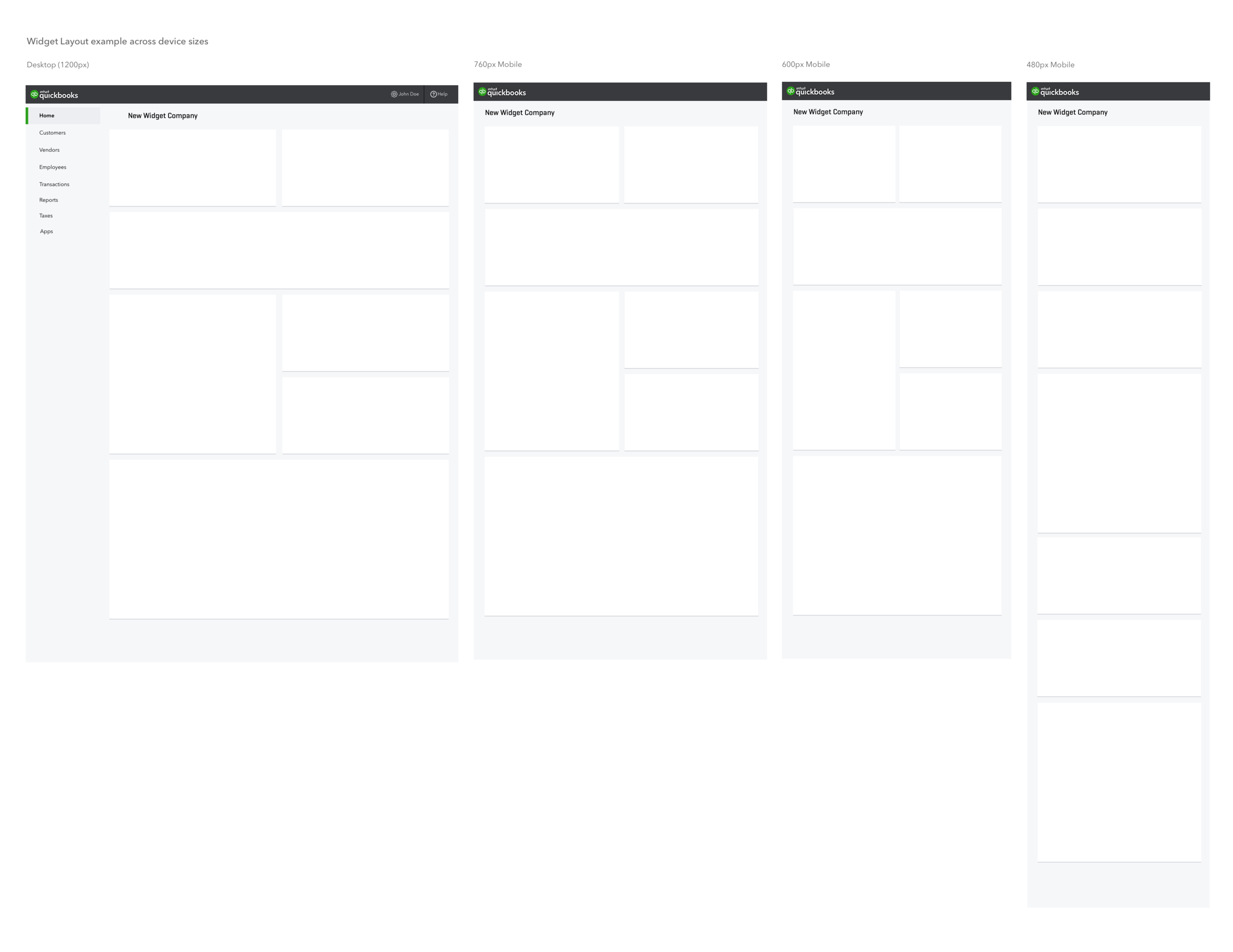
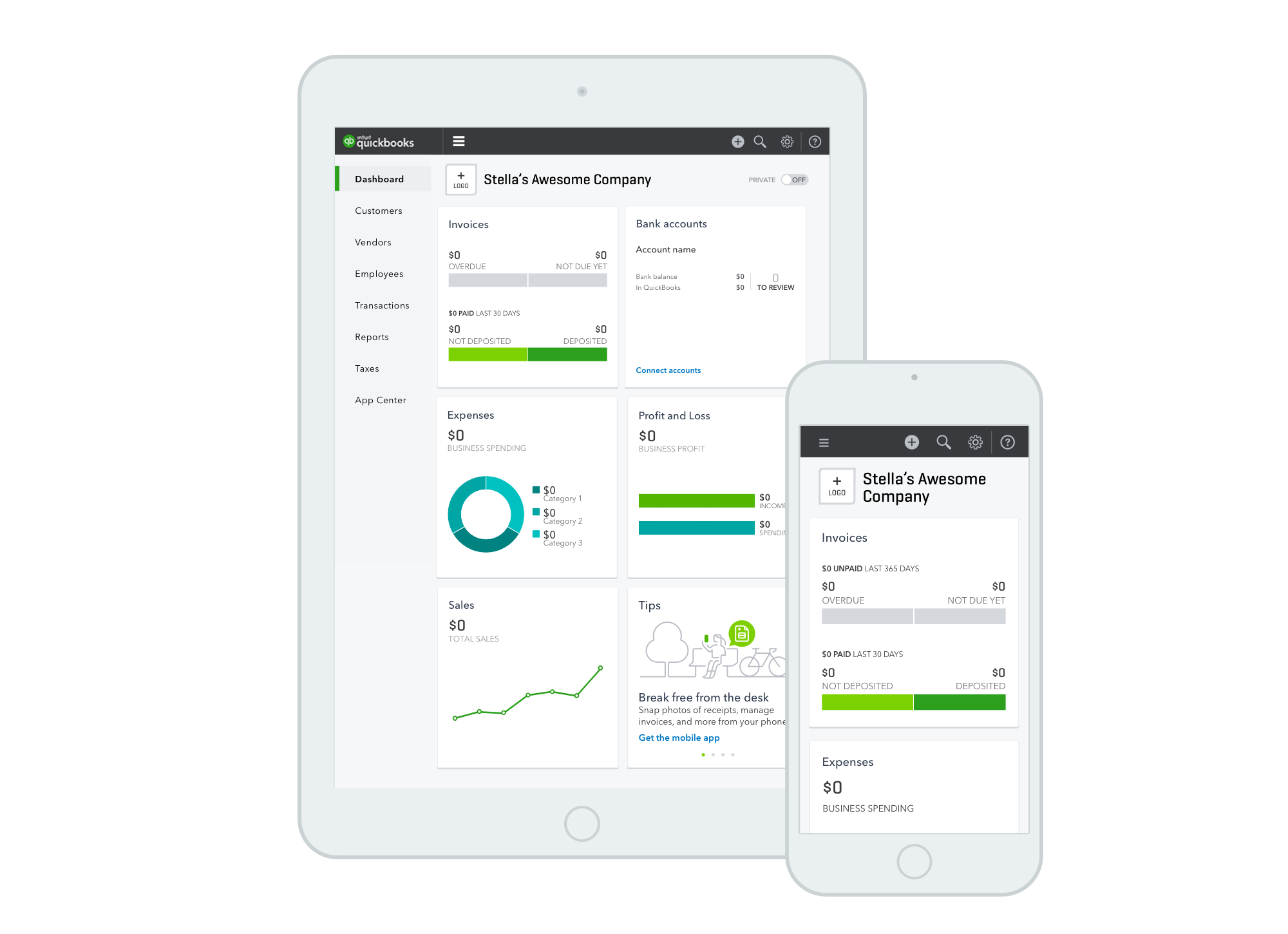
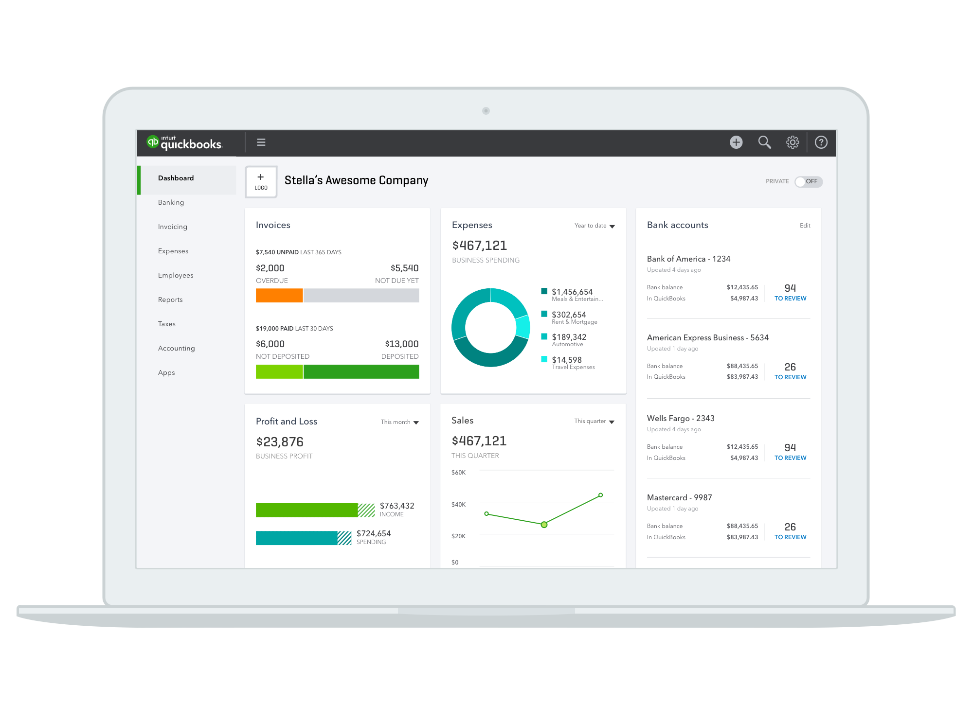
Given that a square-based layout met all our success criteria, the next question was then: do the squares scale, or are they a fixed size? And exactly how big do we make the squares? After more exploring, sketching, and playing with post its, we figured out there was a size that would fit perfectly in three columns for our users' most common desktop size, two columns on iPads, and one column on smaller mobile devices.
Our design engineering team built a prototype of the new look, grid and breakpoints, which we shared with our leaders and stakeholders. Their prototype showed how the new dashboard would look and feel, and provided a clear illustration of our rationale for the square-based layout.
A CONTRIBUTION MODEL FOR CREATING WIDGETS
Three new widgets were being built and tested in parallel with the new dashboard, so several other teams' work depended on our dashboard structure working and making sense. The next challenge we faced was how – with five weeks until we had to hand off designs to our developers – to train a team unfamiliar with the dashboard to design, build, and test widgets. To help teams contribute widgets that followed consistent interaction models, we created a visual template and a list of recommended interaction guidelines.
We met with each team that were contributing widgets and supported them as they iterated and tested their content and designs. In addition to the template and guidelines, I led a weekly standup to make sure the contributing teams had their questions answered and were on track to meet our deadline.
SHARING OUR VISION
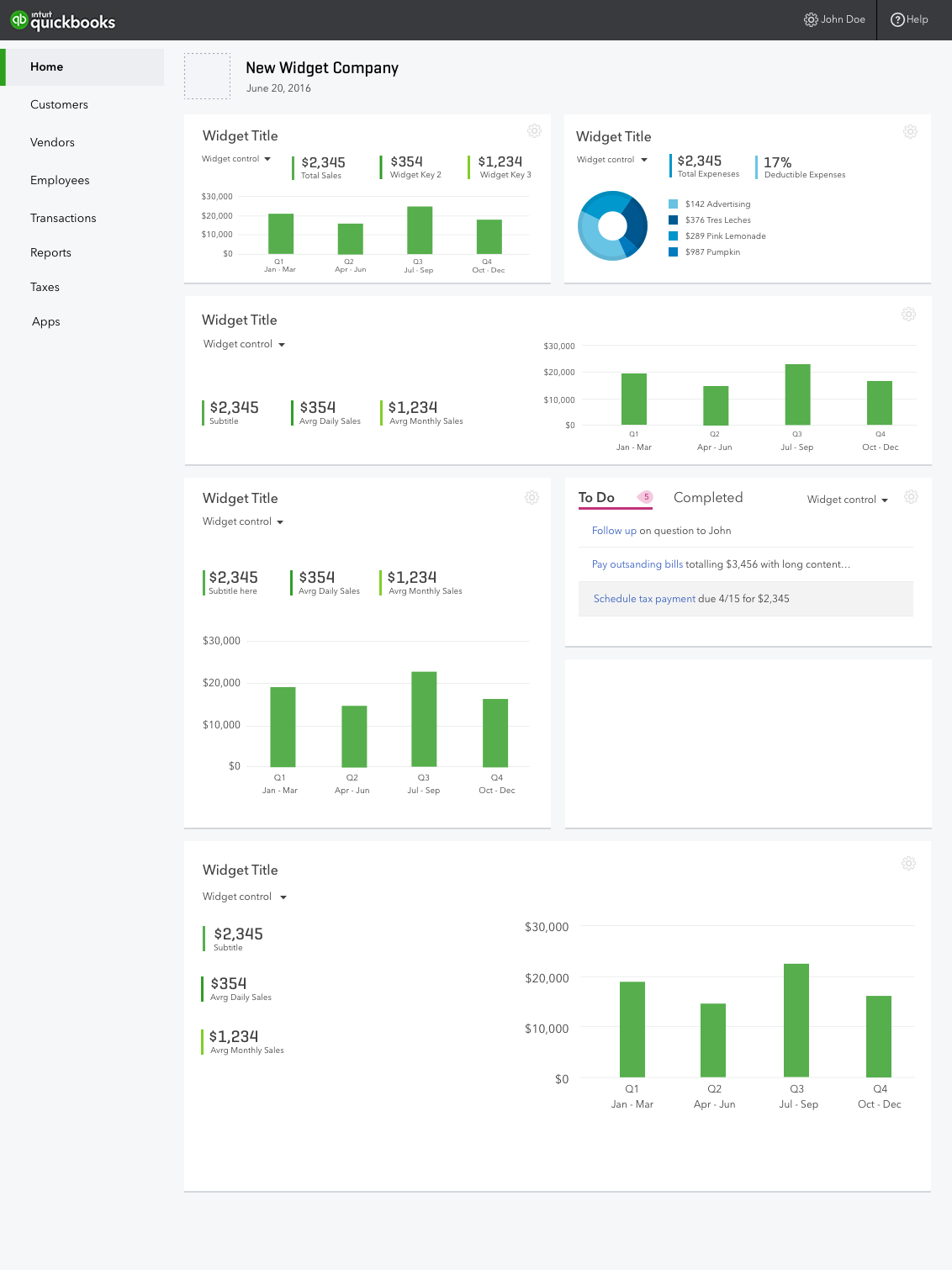
To share out the new look and feel of the dashboard before it was time for detailed visual design and specs for each widget, I mocked all possible states of the dashboard, including the different layouts users would see based on their answers to the setup interview, and pulled in the explorations on the new widgets that other teams were developing. We also used these mocks for a huge end-to-end Invision prototype of the entire release, which included the complete user flow from google search to a setup interview for new users, to the product, and then went deep in to product flows.
We used these mocks to get organizational alignment on our design direction with leaders and other teams, and for user testing the new setup guide. These mocks made sure everyone was on the same page regarding the look and feel of the new dashboard and that there would be no surprises in the release.


THE HOME STRETCH: SPECS FOR DAYS
After several rounds of testing the new dashboard layout while working on the setup guide, we were confident moving forward with the square grid. Customers were excited to see the modern-looking, colorful and data-rich dashboard, and assumed based on the new look that they could customize it, which was our intent. We already knew users enjoyed seeing their finances visualized in the dashboard, and the feedback on the new look was strongly positive. We were also confident in the structure having the flexibility to adapt and grow to support more content in the future.
The new QuickBooks brand colors and typography were being developed by an internal brand team but were not ready for us to use in our release, so my visual design partner worked tirelessly to create consistency across the widgets in the layout and to polish each one.
The last steps were to create a mountain of interaction and visual design requirements and specs for all the states of each widget. To accomplish this, as our developers were already building the new containers and grid, I mocked up every state of each widget as and handed each off to our visual designer. We pulled together the widgets the other designers had contributed and made sure the typography and use of color was consistent, and that the dashboard looked and felt highly polished.


We tested and QAed the dashboard designs and widgets for quality, interaction, UI and visual bugs. With support from the widget designers and our visual design partners, I set up a series of check in meetings to make sure each widget met our bar for design quality and that each one would be delivered on time. To keep the team moving and facilitate communication between the designers and the developers, I set up a Confluence wiki page with design QA and developer contacts for each widget, and provided the team with status updates as each one was tested and refined.
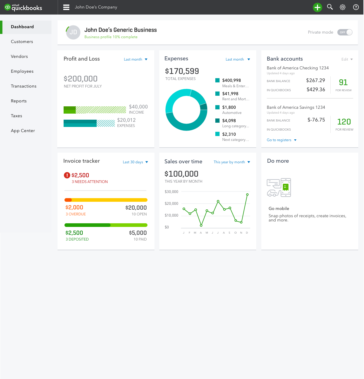
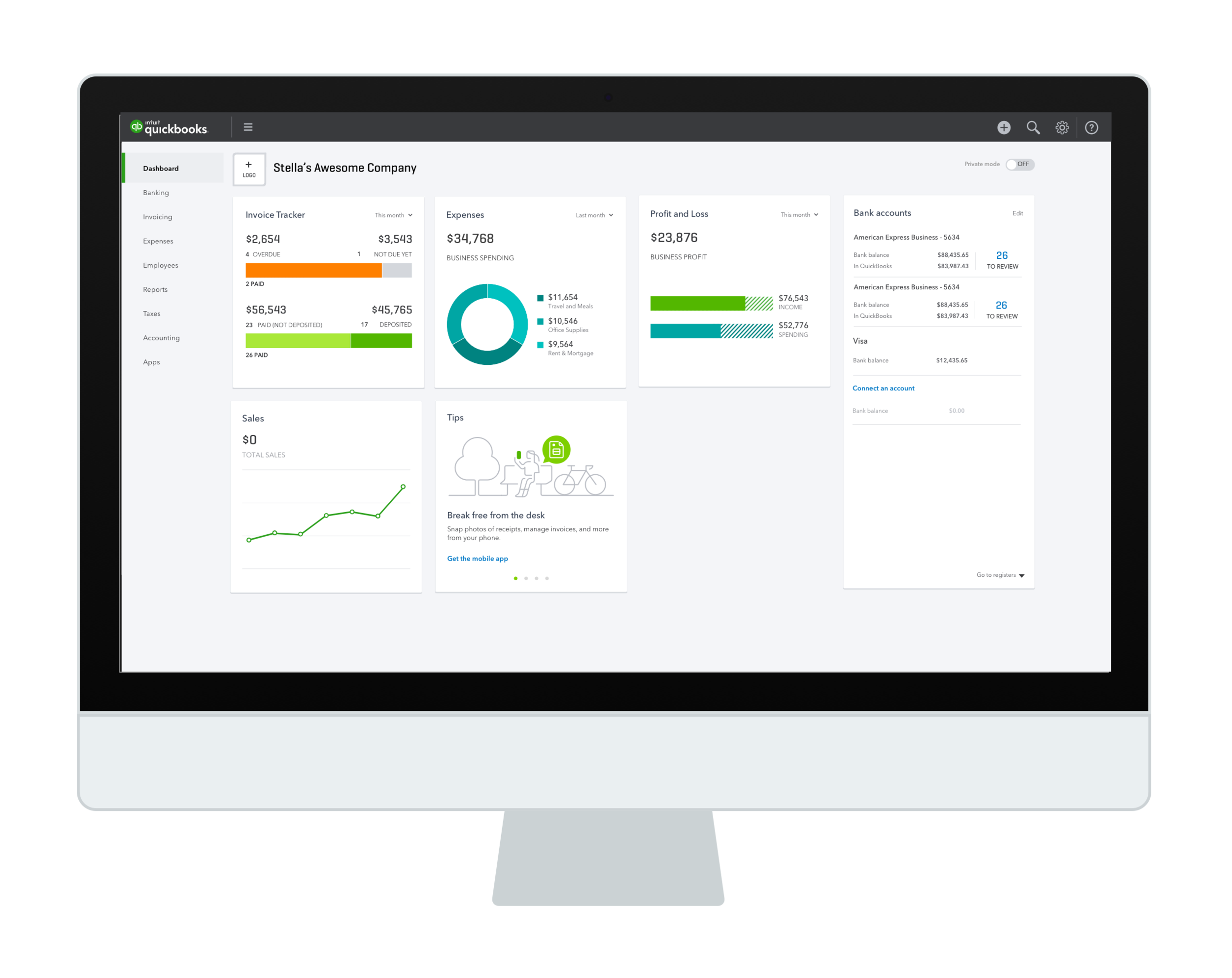
FINAL DESIGNS
Due to scope limitations, we did not include widgets of varied sizes in this first release, though we designed the grid to support widgets of varied widths and heights. We also included a scaled-up mobile widget size, not pictured here, to accommodate larger phones and phablets.
In total we delivered a dashboard with four distinct configurations for different business types, two brand new widgets, and four redesigned widgets that worked across a range of device sizes.
A GOOD LOADING EXPERIENCE
In addition to the new widgets, the setup guide and grid structure, we realized that we needed to refresh the homepage loading experience. Loading is a crucial part of creating a modern and polished look and feel.
The way the old dashboard loaded was antiquated at best. Each widget was static, at 50% opacity, and said the word "Loading data..." on it in small, gray text. It was not elegant or modern, and on slow networks made the dashboard look empty and broken.
Our team team developed several loading concepts, iterated, and built a new loading animation with pulsing widget placeholders which can be seen in the video below.
The old loading experience.
As the grid adjusts to the browser size, the widgets also flow smoothly from three columns down to two, and down to one for a mobile view. We worked with our developers closely to make sure both the loading and the transitions between breakpoints were smooth and elegant.
THE RESULTS
The new dashboard was released as an A/B test for new users. It beat the prior control experience by significant margins across all our metrics and was then rolled out to all users, including to our global regions. We dramatically improved the quality of the dashboard for our customers. It was a major part of the single largest increase in new user and revenue growth in QuickBooks history. I'm happy to share more about the results in person.
Here are a couple examples of the new dashboard as featured in QuickBooks marketing pages. Soon after the release, our sister product, QuickBooks Self Employed, adopted the new dashboard layout for their homepage, too.


CUSTOMER QUOTES
Here's some feedback we received from happy QuickBooks customers right after the release.
Dear QuickBooks, LOVE the new look for Quickbooks online which I discovered this morning. – Paul Gromm
Enjoying the "New Look". More as I use it some more. Overall, I continue to be a delighted customer of QBKS Online after using the desktop version for 15 years. – David Dsouza
Just wanted to let you know I’m working in QBO tonight and loving the new “clean” interface. The home page looks great. The contrast on the buttons is much better as well. - Jeremy
I LOVE the new home page! I especially like how the settings for the time parameters of each widget is sticky, unlike the company snapshot. I also like how the bank accounts are presented with what needs to be reviewed, much cleaner and clearer than before. Thanks for your hard work! - QBOnlineGeek